

SACSA
Category
Branding, Logo DesignAbout This Project
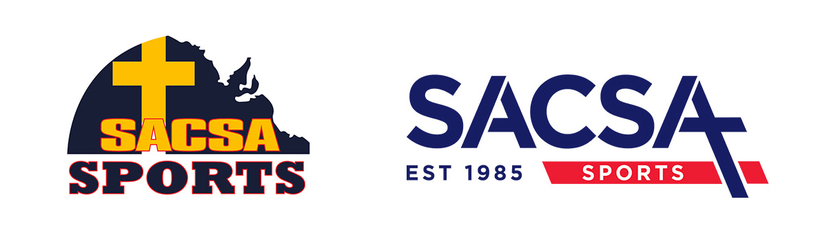
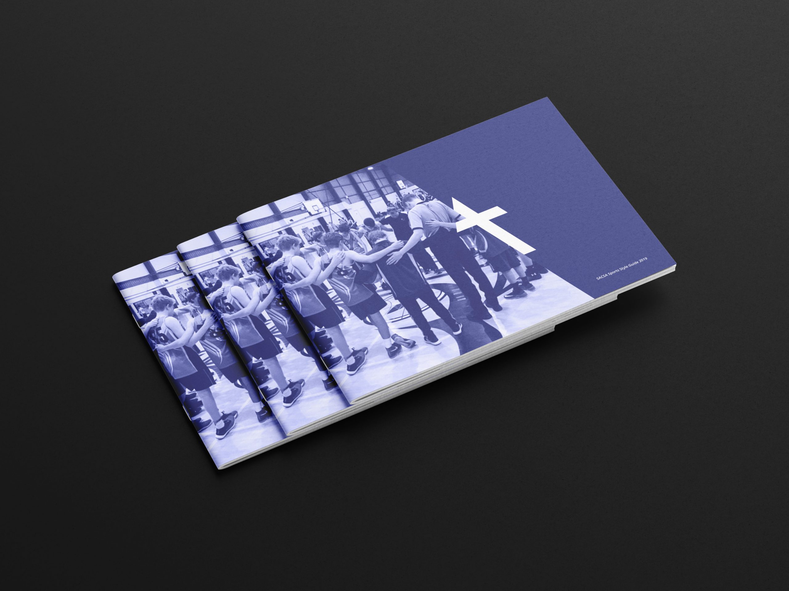
The South Australian Christian Schools Association (SACSA) is dedicated to fostering Christian community within its member schools and showcasing authentic faith through sports. Bee Inspired had the honor of designing a sports logo for Tyndale Christian College, a member school of SACSA. Impressed by our work, SACSA approached us to revitalize their outdated logo and create a comprehensive branding guide to unify their brand identity.
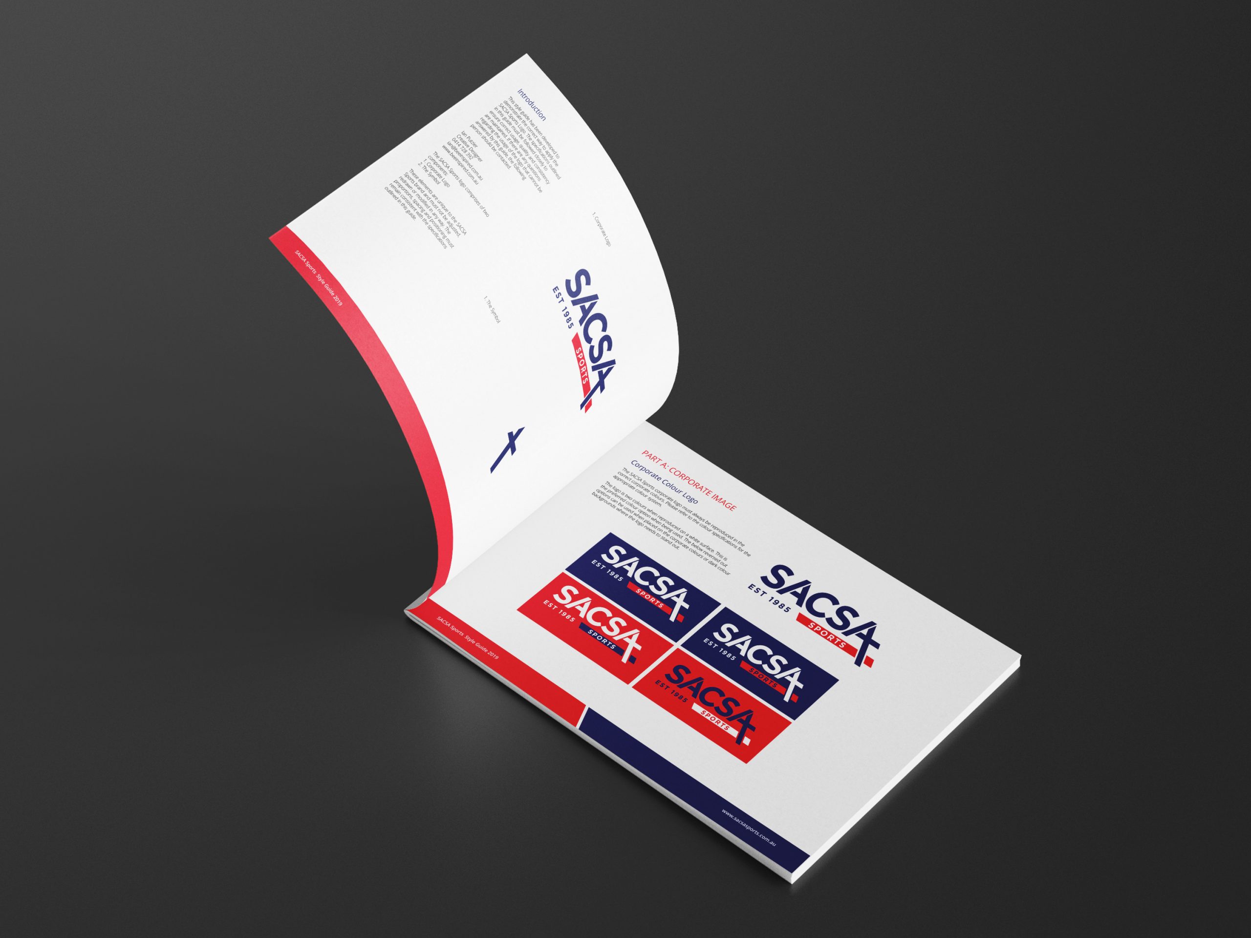
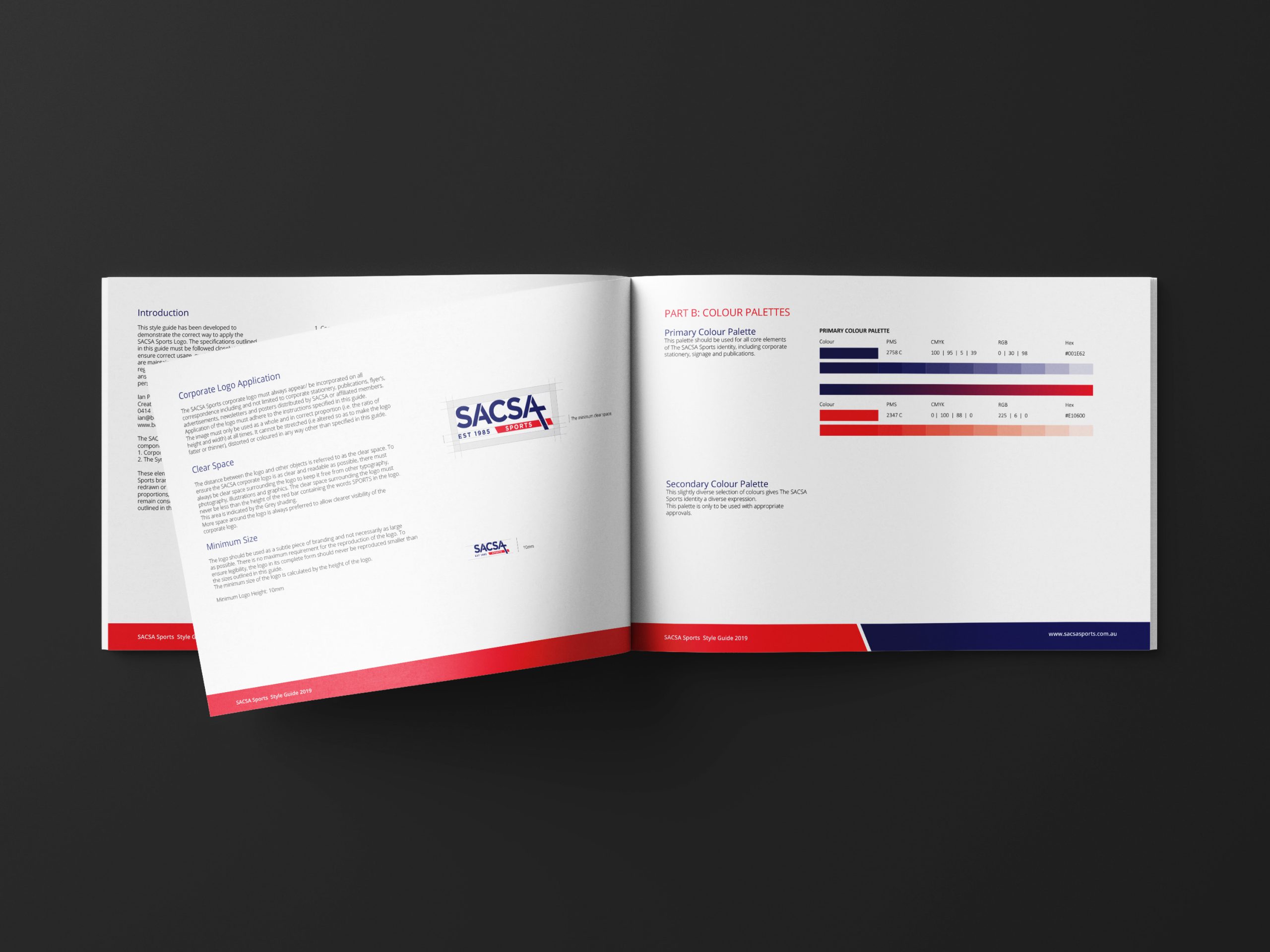
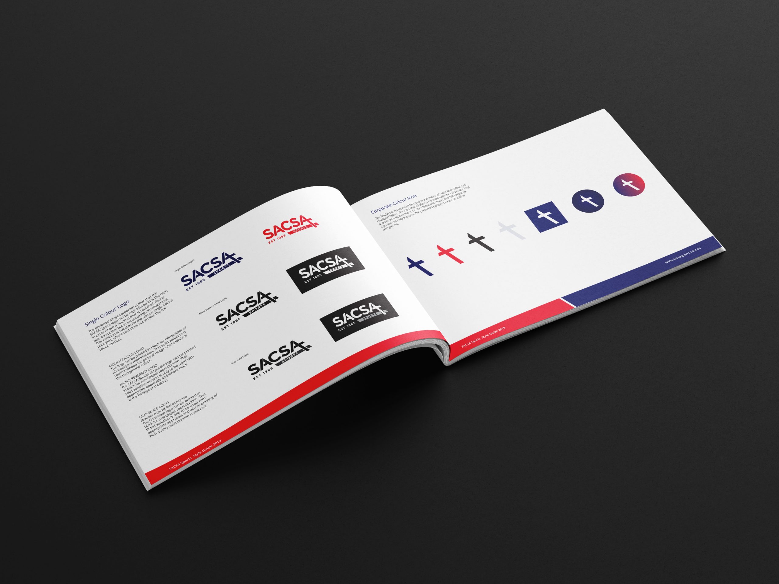
The objective was to create a modern and legible logo that effectively promotes both sports and their Christian faith. Embracing Leonardo da Vinci’s timeless wisdom that simplicity is the epitome of sophistication, we meticulously refined and simplified numerous designs until we arrived at the final logo. The letter “A” in the logo splits to form a cross, symbolizing faith, while the angle of the “A” and the red line below evoke a sense of movement, representing sports. To ensure consistency and cohesion across all brand elements, we proceeded to develop a brand guide that outlines the logo’s application and usage guidelines.
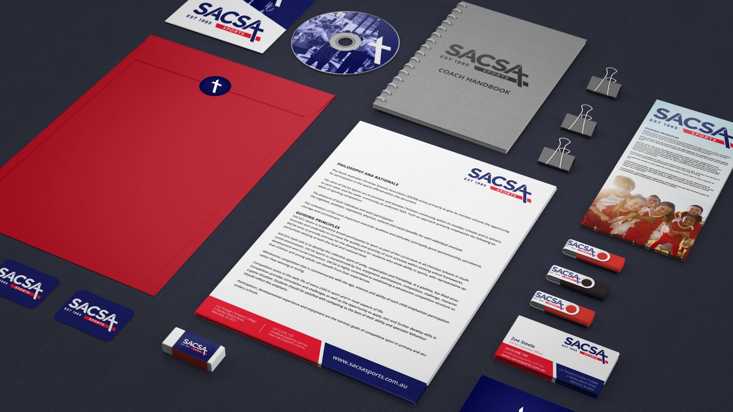
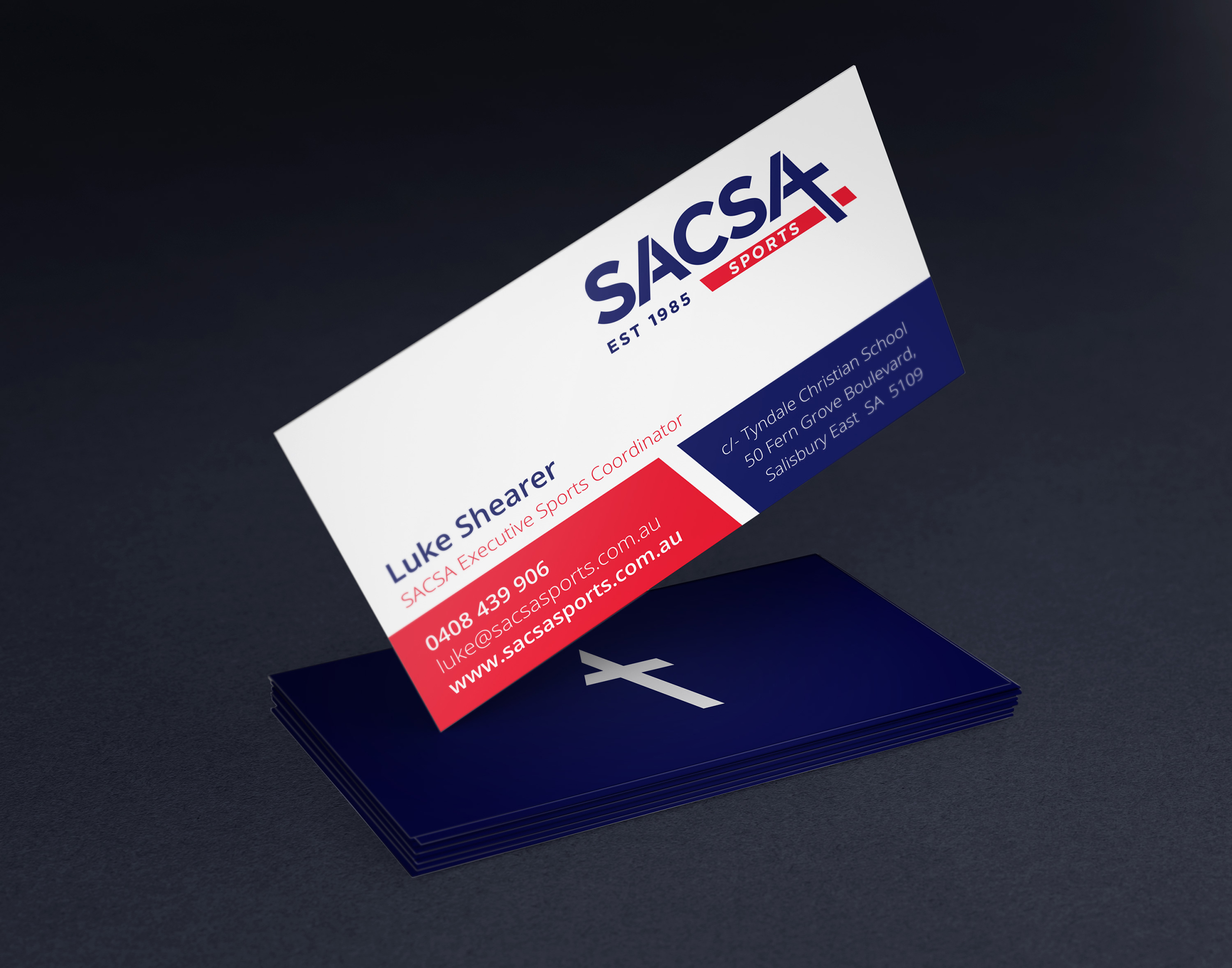
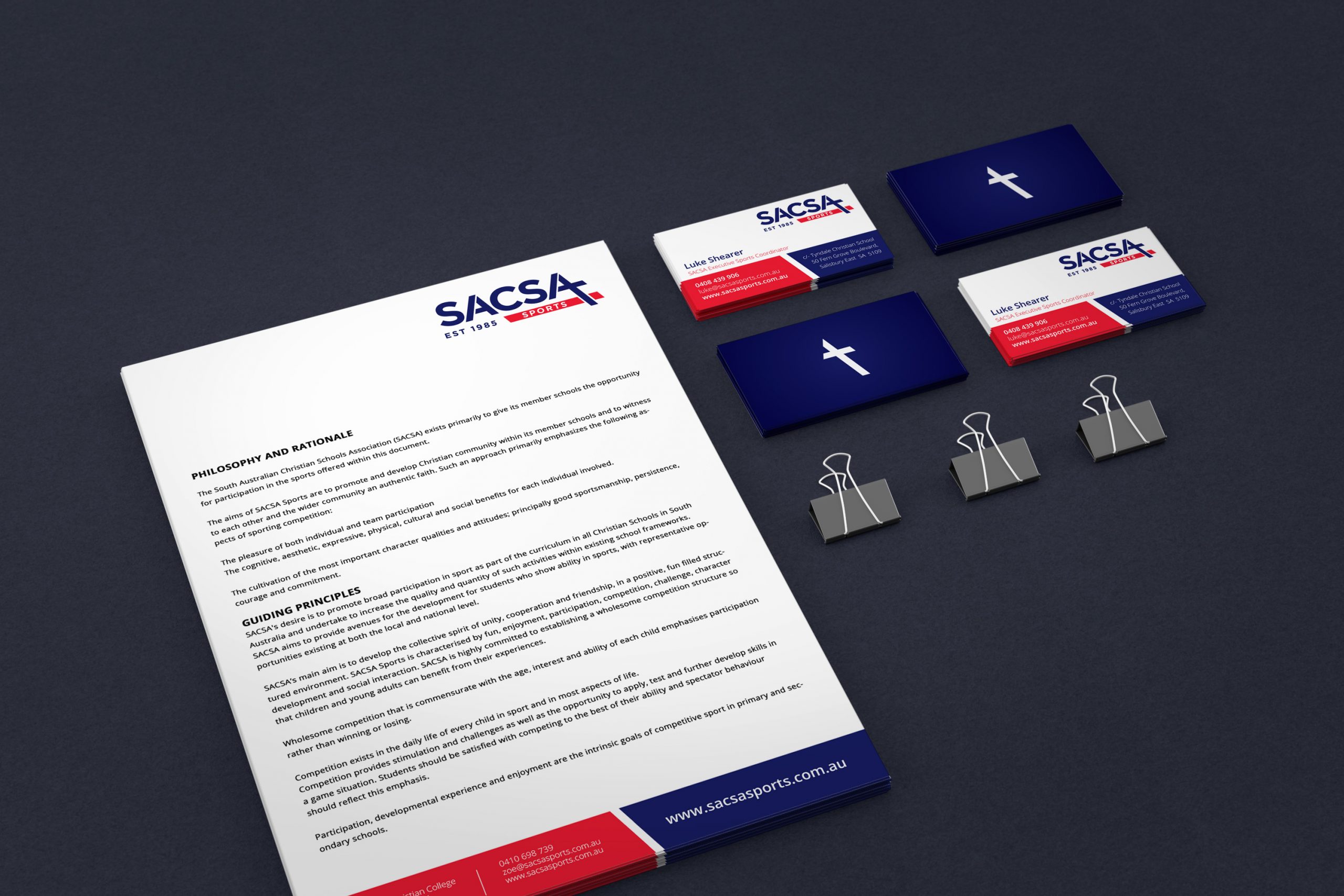
Below, you’ll find a glimpse of SACSA’s brand identity, showcasing the impact of our design work, as well as a snapshot of the brand guide, offering insights into the logo’s versatility and future applications.
Discover how Bee Inspired brings visual storytelling and professional branding expertise to empower organizations like SACSA to convey their values and mission with clarity and style. Join us in celebrating the transformation of SACSA’s brand identity and its ability to resonate with both their member schools and the wider community.